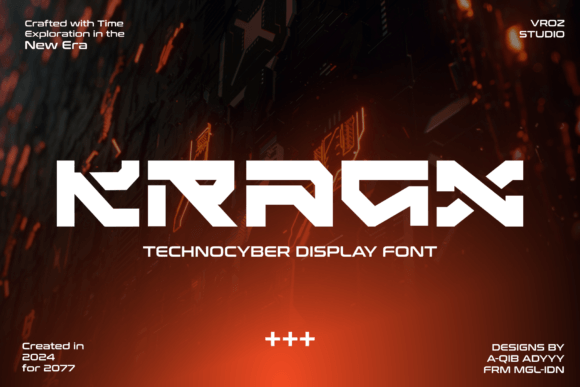
Kragx: A Futuristic Display Font for Digital Brand Identity
As a UI designer who ships landing pages, SaaS dashboards, and conversion-focused e-commerce experiences, I don’t reach for display fonts lightly. They need to earn their place—not just look cool in a mockup. Kragx does exactly that. It’s not another overstyled cyberpunk novelty; it’s a purpose-built display font rooted in tech clarity, with sharp geometry, consistent stroke modulation, and subtle terminal treatments that nod to circuitry without sacrificing legibility at scale.
Kragx thrives where digital presence needs intention: hero section headlines, product launch banners, app onboarding screens, and branded content headers. Its letterforms—clean, angular, and confidently minimal—communicate precision and forward motion. Think of it as the typographic equivalent of a well-designed dark-mode interface: functional first, expressive second. That balance makes it unusually versatile for a display typeface. It doesn’t scream “futuristic”—it feels like the future has already arrived.
In practice, Kragx excels in high-impact, low-text contexts. Use it for your primary headline above a CTA button, not for paragraph copy. Apply it to shop category banners, course title cards, or portfolio project labels—anywhere you want users to pause, recognize tone, and associate your brand with innovation and control. On mobile, keep line lengths tight and font sizes generous: 48px+ for hero titles, 32px+ for section headings. Avoid stacking more than two lines of Kragx text in narrow viewports—it’s designed for impact, not density.
Readability holds up surprisingly well across backgrounds. On light interfaces, Kragx gains crisp contrast; on deep charcoal or near-black backgrounds, its clean terminals prevent visual bleed. For image overlays, use a subtle semi-transparent background behind the text—or apply a soft 1–2px text shadow—to ensure legibility without compromising the aesthetic. Avoid ultra-thin weights on low-resolution screens; stick to the Regular or Bold variants for production use.
Kragx isn’t meant to stand alone. Pair it deliberately. For body copy, pair with a neutral, highly readable sans serif—think Inter, Manrope, or IBM Plex Sans. Their open counters and generous x-height create rhythm against Kragx’s tighter, more structured forms. If your brand leans editorial—say, a tech newsletter or design publication—try pairing Kragx with a restrained serif like Literata or PT Serif for subheads. The contrast reinforces hierarchy without competing: Kragx commands attention; the serif supports comprehension.
It works especially well for brands that occupy the intersection of creativity and capability: indie dev tools, AI-powered productivity apps, boutique hardware startups, or creative agencies building digital-first identities. One client used Kragx for their no-code platform’s launch page—hero headline, feature card titles, and pricing plan headers—all paired with Inter for everything else. Conversion lift wasn’t just from messaging; it came from how quickly users understood *what kind of product this was*, before reading a single sentence.
For logo design or wordmarks, Kragx delivers strong recognition at small sizes—especially when simplified to uppercase. Its monoline structure and balanced proportions scale cleanly down to favicon size (though always test at 16×16 and 32×32). Avoid using it for navigation labels or inline links: it lacks the functional weight and spacing needed for sustained scanning. Save it for moments that define tone—not those that support flow.
The family includes Regular and Bold weights, with OpenType features like standard ligatures and alternate glyphs—useful for fine-tuning custom headlines or avoiding awkward character collisions (e.g., “AV” or “To”). Webfont files are WOFF2-optimized, with straightforward CSS @font-face declarations. It supports Latin-based languages out of the box; check documentation if you need extended diacritic coverage for multilingual sites.
Licensing is straightforward but essential to clarify: Kragx is a commercial font, and its license covers web use—including live sites, client projects, SaaS platforms, online stores, email templates, and digital ad creatives. You’ll need a separate license for desktop use in Figma, Sketch, or Adobe apps—but most designers grab both, since prototyping fidelity matters. Never embed unlicensed fonts via @import or third-party CDNs; self-host or use a licensed font service to stay compliant and ensure consistent loading.
Where other display fonts fade into background noise after three uses, Kragx maintains its distinct voice because it’s restrained by design—not by accident. It doesn’t rely on excessive distortion, exaggerated serifs, or forced glitch effects. That restraint is what makes it durable across seasons, campaigns, and platforms. It’s equally at home on a minimalist portfolio site and a high-energy digital product launch—because its personality is clear, not chaotic.
Try it where hierarchy needs reinforcement: swap your current hero font for Kragx on your next landing page iteration. Keep body copy unchanged. Watch how much faster users anchor to your value proposition—not because the font is louder, but because it signals competence, cohesion, and intentionality. In digital design, that kind of quiet confidence often converts better than any animation or micro-interaction.
If your brand lives at the edge of what’s possible—without losing usability—Kragx isn’t just a display font. It’s a deliberate design decision with measurable impact on perception, engagement, and identity consistency.