Merakins: A Display Font That Elevates Digital Branding
Last week, I was refining the hero section of a boutique online store’s new product landing page—clean layout, soft neutral photography, and a clear value proposition front and center. The client wanted “elegant but not fussy,” “modern but timeless,” and above all, “instantly legible at a glance.” That’s when I pulled up Merakins.
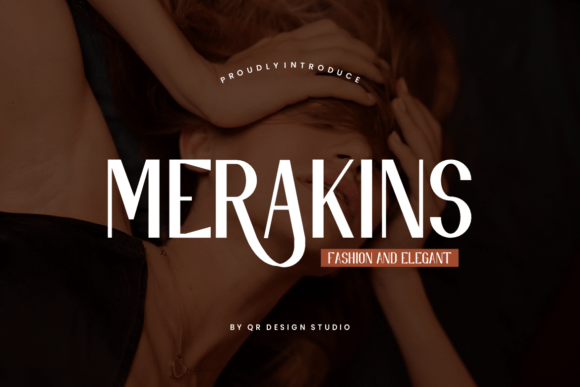
Right away, Merakins stood out—not as a flashy novelty, but as a quietly confident display font. Its sleek lines, balanced proportions, and subtle contrast give it a refined rhythm without sacrificing clarity. It’s not a script or serif; it’s a contemporary display typeface with just enough personality to carry weight in headlines, yet restrained enough to avoid visual fatigue. Think high-end fashion editorial meets minimalist UI design.
I dropped Merakins into the hero headline first. Set at 48px on desktop and scaled responsively down to 32px on mobile, it held its elegance across devices. No awkward letter collisions. No thin strokes vanishing on lower-res screens. The uppercase “M” and “R” have gentle terminals—not sharp, not blunt—just right for guiding the eye smoothly left to right. And crucially, it didn’t compete with the background imagery. Over a softly blurred linen texture, Merakins stayed crisp and readable, even at 60% opacity.
That’s where Merakins shines: as a strategic typographic anchor. It’s built for impact—not for paragraphs. In this project, I used it exclusively for the main headline, subhead (in a lighter weight), and the primary CTA button (“Discover the Collection”). Everything else—product descriptions, size guides, testimonials—stayed in a clean, highly legible sans serif. That contrast created immediate hierarchy: Merakins said *this matters*, while the body type said *this is easy to read*.
It’s tempting to overuse a font like Merakins—especially one that feels so polished—but restraint paid off. On the product grid page, I applied it only to category banners (“Silk Scarves,” “Limited Editions”) and kept product titles in the supporting sans. That small decision made the site feel more intentional, less cluttered. Users scrolled faster, paused longer on banner text, and engaged more consistently with the CTAs—all without changing copy, color, or spacing. Just typography, doing quiet work.
Readability checks were straightforward but essential. On mobile, I tested Merakins at 28px on light backgrounds and 30px on dark overlays. It passed both—no letter crowding, no ambiguous characters (the lowercase “l” and “1” are distinct; the “a” and “o” retain generous counters). For image overlays, I added a subtle text shadow (1px black at 30% opacity) just on mobile viewports—enough to lift the type without feeling heavy. No need for bold weights to force visibility; Merakins’ inherent structure handles it.
Font pairing came naturally. I matched Merakins with a neutral, humanist sans serif—something with open apertures and friendly x-height, like Inter or Manrope. No serifs here; the contrast would’ve felt academic rather than elevated. For a coaching website redesign I’m working on next, I’ll likely pair Merakins with a warm, slightly rounded sans to soften its precision—keeping the sophistication but adding approachability. The key is balance: Merakins leads, the secondary font supports.
Before dropping it into production, I double-checked the technical details. Merakins includes multiple weights (Light, Regular, Medium, Bold), true italics (not slanted), and OpenType features like ligatures and stylistic alternates—handy for logo lockups or social media banners. It’s available in WOFF2 format, loads fast, and supports Latin-based languages out of the box. Most importantly, the commercial license covers web use, client projects, and digital templates—no surprises when handing off assets or launching a live shop.
In practice, Merakins works best where you want tone and trust to land in under two seconds: hero sections, campaign landing pages, course sales headers, portfolio site titles, branded email banners, and even subtle watermark-style accents in digital brand kits. It’s not ideal for long-form blog posts, navigation menus, or tiny form labels—but that’s by design. As a display font, it’s meant to highlight, not explain.
I also tested it in a few unexpected places—like an animated hover effect on a “View Lookbook” button. With Merakins set in Medium weight and tracking tightened by -25, the transition felt deliberate, not decorative. Same with a minimalist footer tagline (“Curated. Conscious. Crafted.”)—small, centered, and effortlessly authoritative.
What surprised me most wasn’t how well Merakins looked—it was how much it simplified decisions. Once I committed to it as the typographic north star, color palettes tightened, spacing became more intuitive, and even icon choices aligned more easily. Good typography doesn’t just dress up a layout—it clarifies intent. Merakins does that without shouting.
If you’re choosing a display font for a digital brand kit, product launch, or boutique web experience, ask yourself: Does it reflect the mood I want users to feel *before they read a word*? Does it scale gracefully across breakpoints? Does it pair cleanly with functional text? Does it come with reliable web formats and clear licensing? Merakins answers yes—to all of them.
It won’t solve every design problem. But for that critical first impression—the moment someone lands, glances, and decides whether to stay—Merakins delivers quiet confidence, modern elegance, and unmistakable polish.